CareData Physician Dashboard: User Research, Interface Design, Naming & Identity
Responsibilities: Project Lead, User Research Lead, UX and UI Design Team Member, Identity Design
Project published in JMIR: the leading peer-reviewed journal for digital medicine and health
Project completed while at Pivot Design Group
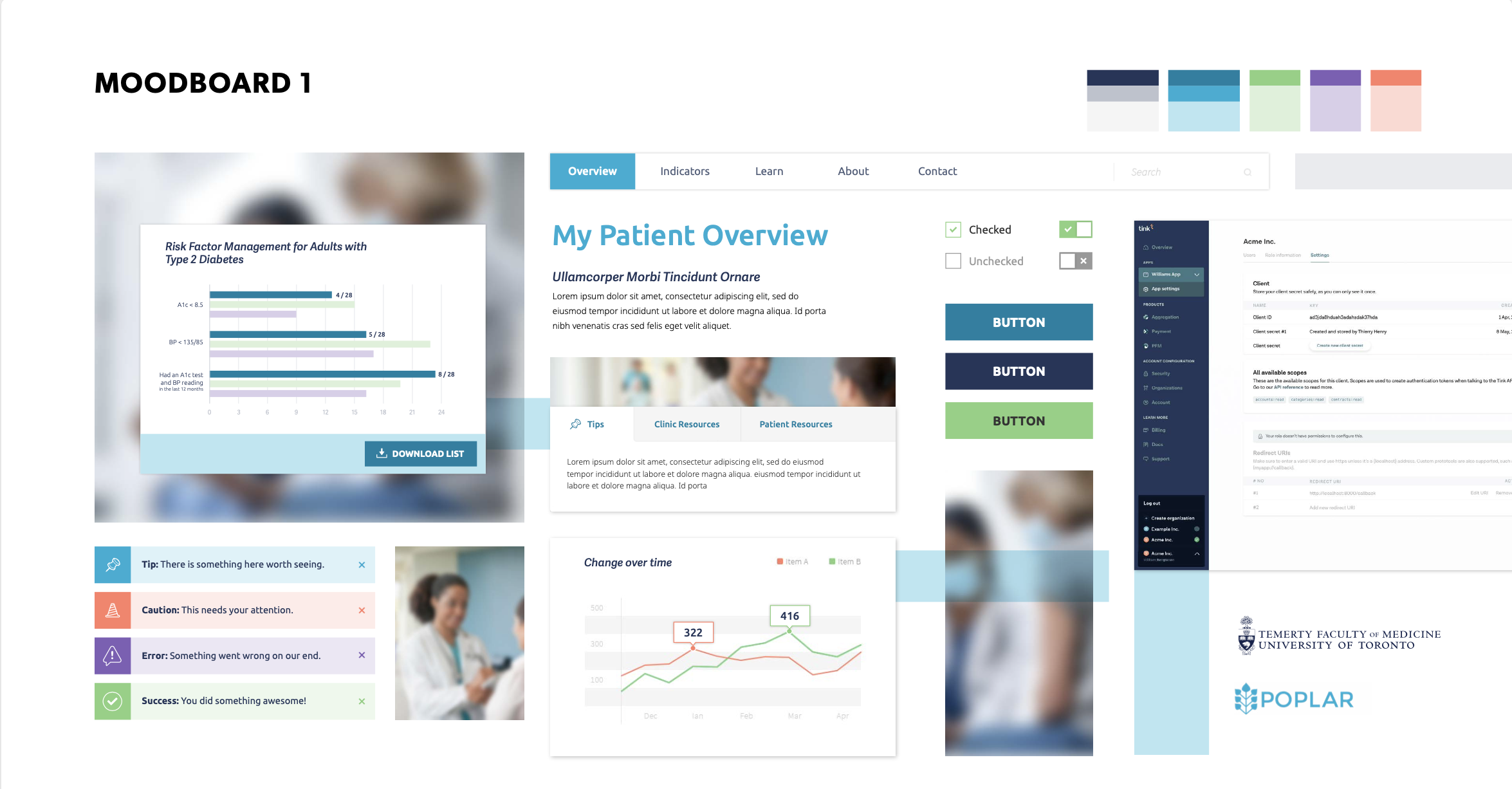
The role of Family Physician is to care for not only their individual patients but also their communities by addressing gaps in care. No small feat! The Department of Family and Community Medicine and the Quality and Innovation Program at the University of Toronto had an initial prototype and research for how to present big data to physicians in an effort to help them better care for their communities however the initial prototype needed a more effective user experience design that took into consideration the underlying motivations and barriers to adoption for a dashboard like this.

Research Approach
The UX research approach was designed to better understand the users ahead of redesigning the interface. Given the busy schedules of the physicians in our stakeholder team and considering the availability of the physician candidates to be involved in the research, 2 strategic co-design sessions were added to the project to replace the originally planned 1-on-1 interviews.
Co-design Worksessions (user research) with stakeholders and family physicians to develop User Personas and better understand the motivations of the users and their potential barriers to adoption
User Personas to outline the key Physician user archetypes
Co-design Worksessions (naming)


Design Solution
Personas: The persona work lead to the creation of 4 priority personas of diverse usage scenarios, backgrounds, motivations, and barriers. These became the keystones for the project design and allowed design decisions to revolve around the physician sentiments captured in the persona documents.
Interface & User Experience: Throughout the iterative design process, care was taken to present the data in a manner that allowed for priority information to come to the surface, for key action areas to be clearly visible, and for next steps to be just a click away. Reducing the cognitive load for physicians who are already operating in busy clinic settings became the driving force for the dashboard design.
The initial interface design project addressed user needs for a few specific indicators (diabetes, hypertension, and opioid usage). Over time more indicators were added to the interface to allow for a more robust dashboard giving physicians a “one-stop-shop” to review all relevant data for their communities.
Additional interfaces were also designed to cater to the needs of other users: at the regional/clinic level and at the larger Ontario Health Team level.
Naming & Identity: A rapid naming process was undertaken to brainstorm and narrow down the list of appropriate names for the audiences. A simple wordmark was designed to work across all three dashboards.